Caresse meaning in French: to touch or affect as if with caress, to touch lightly in a loving or endearing manner.
Caresse is small team of herbal enthusiast that created three innovative recipes for calming tea. The herbs that are used are wildly growing in the Balkan Mountains. Products have exceptional healing properties and benefits for a calming and balanced mood. A premium new approach for today’s new normal. The company is inspired by the French “Savoir vivre” which we understand as the ability to live life well and with intelligent enjoyment. The brand will be launched on the French market. Caresse’s goal is giving people a feeling that reminds us to slow down and enjoy life, reduce stress and anxiety in a natural and healthy way, bringing a new style of holistic rejuvenation and providing a high-quality tea experience.
In the branding, I wanted to highlight the research and craftsmanship of the herbs Caresse is working on for her teas, and created an illustration of a mandala-like plant as the brand's main symbol. Choose elegant and minimal font pairings to give the brand a clean look. Created a unique badge shape that is complementary to the main illustration and a monogram with C letter and intertwined petals to use on small stickers.
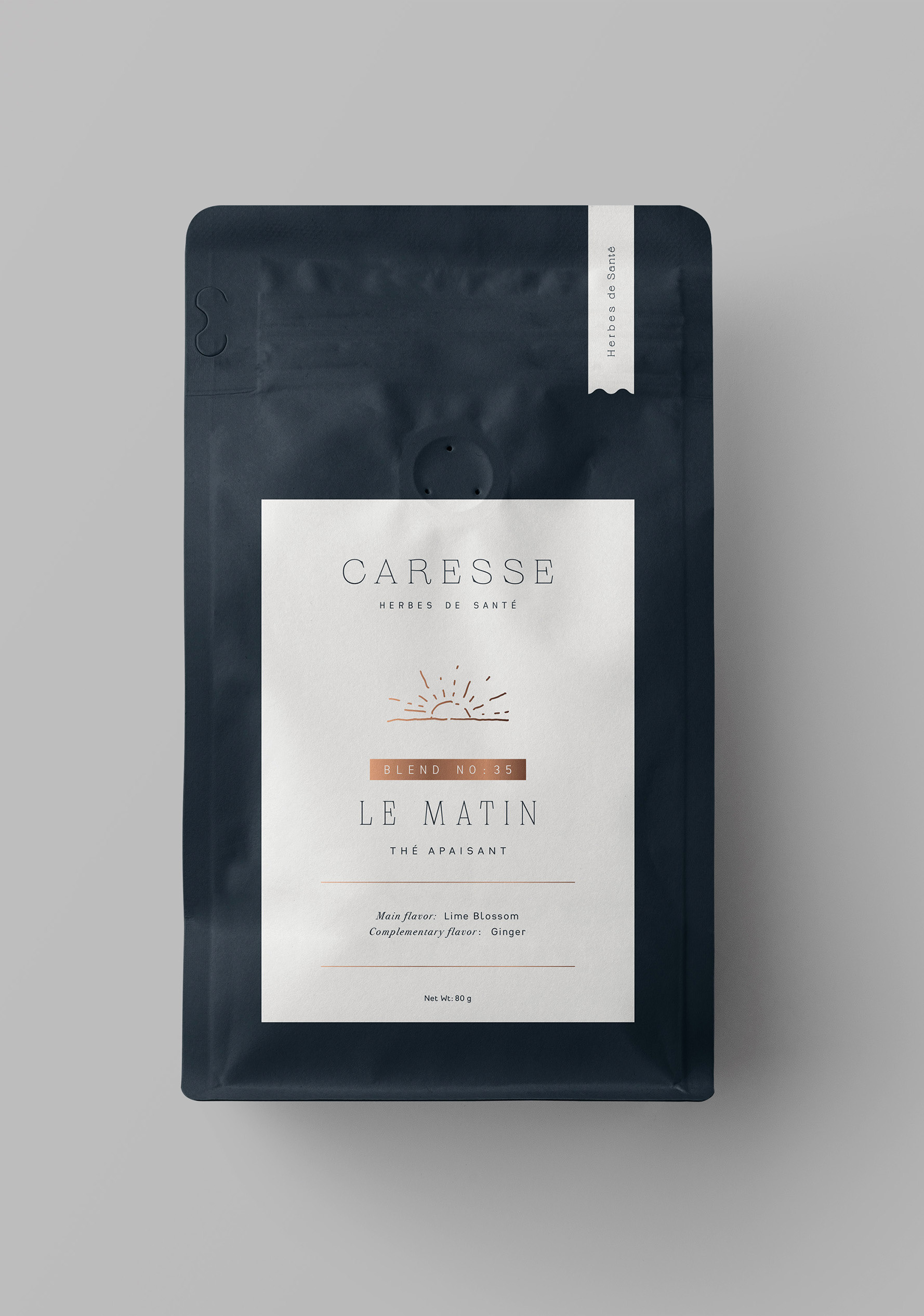
The brand has 3 different tea blends for different times of the day, le matin (morning), après - midi (all day) and le soir (evening). I created small illustrations for each blend for their suggested drinking time for packaging design. Main package is copper colored metal tins that can be reused and is environment friendly, we also created paper re-fill packages for brands target client, socially responsible and environmentally conscious people who value luxury brands that celebrate their passions and individuality in a way that can be visually shared on social media.
Logo, Branding & Packaging / 2022


